Design System · Global Rescue · 2024–2026
Brand Design System
Turning a 15-page brand guide into a living system built for designers, developers, and AI-assisted workflows.
When I joined Global Rescue, the brand lived in a 15-page PDF style guide, and the design team was still working in Adobe XD after Adobe had ended its development. Over two years, I led the transition to Figma and, with the design team, transformed those static guidelines into a living design system: a shared foundation for designers, developers, marketers, and AI-assisted workflows.
The result was a shift in how the organization builds the brand, moving from referencing guidelines to building from a shared source of truth, which made the brand more consistent, scalable, and easier for teams to use.
The brand existed in three places: a 15-page PDF, a growing collection of Adobe XD files, and years of content scattered throughout the CMS. The guidelines themselves were thoughtful, but they were designed primarily for print. They could tell you the Pantone value of Global Rescue Red or the required clear space around the logo. What they couldn’t do was give a designer a reusable component, give a developer a structured token, or give an AI system the context needed to reproduce those decisions accurately.
The first step was moving the team to Figma. Adobe XD had become a dead end, and the migration was also an opportunity to rethink how the team worked, how design decisions were documented, and how the brand could scale across an increasingly digital organization.
From there, I led the team in translating the brand guide into a living system. Print specifications became semantic design tokens. Colors, typography, spacing, radius, and elevation became shared foundations. Components became reusable building blocks. The brand became something the organization could build with.
That shift required more than design work. I led the creative direction and the architecture, defined the standards the system had to hold to, and worked across design, development, marketing, and leadership so it solved operational problems as well as creative ones. I stayed in the work throughout, in the files and in the problems, while trusting the design team to own and execute at a high level. The detailed tokenization and component construction that made the system real was largely theirs.
My job was ultimately to create the conditions for good work: set the direction, make the decisions that needed making, remove the ambiguity, and give the team a system worth building on.
Today, the system supports the people who build the brand across the organization. Designers work from shared components and foundations. Marketers can assemble approved page sections. Developers can work from the same underlying design language, and AI-assisted workflows have structured design information to work from rather than trying to infer the brand from screenshots or static documentation.
Designing for AI wasn’t an afterthought. As AI became increasingly capable of participating in creative workflows, the system was already structured to give it something meaningful to work from. Semantic naming, variables, component structure, and reusable patterns all make the system more legible to both humans and machines. Rather than retrofit the brand for that future, we built the foundation with it in mind.
Impact
01 From Static to Living
Make the brand buildable.
The new system took the decisions the old brand guide documented and made them reusable.
The inherited brand guide did exactly what it was designed to do. It documented the visual identity with clear standards for print: colors, typography, logo usage, and layout. What the organization didn’t have was the next layer, a design system that translated those decisions into reusable components, semantic tokens, and implementation rules for digital work. Every designer, developer, and marketer still had to interpret the guide before they could build with it.
That gap was the case I made internally. Adobe ending development on XD was the obvious trigger, but the argument I made was larger: the brand needed to stop living in documentation. Getting the team onto Figma was the first move, and it gave the brand somewhere to actually live.
02 Building the Foundation
A system of decisions, not files.
A four-layer architecture where every interface inherits the same design decisions from a shared foundation.
Every design system has to solve the same problem: how do you keep hundreds of design decisions consistent without forcing people to think about them? The answer we settled on was a layered architecture. Semantic design tokens form the foundation. Components inherit those tokens. Global components build on those, and full-page sections combine everything into reusable building blocks.
I set the architecture and the standards it had to hold to; the design team built it out. The structure was never about organizing Figma files, it was about organizing decisions. A marketer assembling a landing page works from approved sections. A designer creating something new works from components. Both inherit the same underlying tokens automatically, which keeps the brand consistent while letting each person work at the level of abstraction their job actually needs.
03 Design Tokens
Defined once, inherited everywhere.
Print specifications, rewritten as semantic tokens the whole organization can reference.
Every design system begins with a shared vocabulary. Rather than hard-coding values into components, the team defined color, typography, spacing, radius, and elevation as semantic tokens that could be referenced throughout the system.
The work was in defining the rules those variables encoded. Primary colors carry default, hover, and active states. Neutral colors follow a numeric scale. Accent colors are reserved for data visualization, and semantic status colors are limited to alerts and system messaging rather than branding. Those decisions remove ambiguity because they live in the system instead of in someone’s reading of it.
Those choices reached past design. Token names, variable structure, and component organization were all set with implementation in mind, because the same system had to serve designers in Figma, developers building WordPress components, marketers assembling pages in WPBakery, and AI-assisted workflows. Working that out meant design and development in the same room regularly, rather than a handoff at the end.
04 The Library
Stop rebuilding the same thing.
Every variant and state defined once, documented completely, and shared across design, development, and AI-assisted workflows.
A design system only works if people stop recreating the same solutions. We established a reusable component library covering the interface patterns the organization used most often: buttons, cards, accordions, and form fields, through to navigation elements, icons, and logo treatments.
Each component was defined with its variants, interaction states, anatomy, accessibility considerations, and semantic token relationships. The goal was not simply to create a library of reusable UI. It was to make the decisions behind that UI explicit.
I set the creative direction and system architecture, working closely with the design team to establish the standards the system needed to support. Junaid Imdad, whose strength is design-system construction, led much of the detailed tokenization and component work, turning that direction into a structured, scalable Figma system.
That distinction mattered. Designers could work from the same source of truth, developers had clearer implementation guidance, and AI-assisted tools could increasingly understand the same underlying design language. Instead of translating intent between teams and tools, we were creating a shared contract.
The objective was consistency, but more than that it was removing unnecessary interpretation from the workflow.
05 Shared Infrastructure
One system, many teams.
Approved page sections let marketing build new experiences without starting from a blank canvas.
Once the foundations and components were established, we began assembling them into larger building blocks. Global components such as the header, footer, and navigation created consistency across experiences, while reusable page sections gave marketing a library they could compose from: hero banners, service overviews, FAQs, contact forms, pricing, and campaign modules.
This changed the workflow. Instead of commissioning a new design for every landing page, marketers could assemble experiences from approved sections that already reflected the design system. Designers could focus their time on the problems that actually required design thinking rather than rebuilding familiar layouts.
My role was to define the creative direction, establish the system architecture, and make sure the pieces worked together as a coherent experience. The design team then translated that framework into the reusable patterns and components that made the system practical at scale.
The result was a shift from page-by-page design to composable experience design. The design system stopped being documentation and started becoming infrastructure.
06 Governance
Consistency without rigidity.
One brand, three audiences, without becoming three different brands.
A design system can’t answer every creative decision with components alone. Some decisions require judgment, so we documented those decisions as usage rules rather than leaving them to interpretation.
Global guidance defines how typography maps to the neutral scale, where brand red should and shouldn’t appear, minimum contrast requirements, and the principles that create a consistent experience regardless of who is building the page.
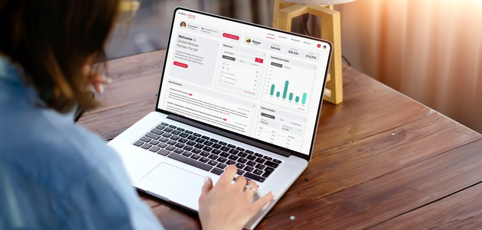
On top of those global rules sit three audience modes: Consumer, Enterprise, and Partner. Each adjusts visual weight, tone, and emphasis to fit its audience while inheriting the same underlying design system. That let the brand behave differently when the context required it without fragmenting into separate visual identities.
From a creative leadership perspective, this was the important distinction: the system needed to create consistency without eliminating judgment. We were codifying the decisions that should be consistent, and leaving room for designers to solve the problems that actually require expertise.
07 Designed for What's Next
Ready for AI.
The system was designed for the workflows creative teams are using today, and the ones emerging next.
When we began rebuilding the design system, AI-assisted creative workflows were already emerging. Rather than treating them as an afterthought, we considered them another consumer of the system.
That influenced the architecture from the beginning. Semantic token naming, Figma variables, component hierarchy, documentation, and usage rules were structured so the underlying design decisions could be understood beyond the Figma canvas itself. The system needed to support designers working in Figma, developers building in WordPress and WPBakery, and AI tools capable of working from the same design language without relying entirely on screenshots or manual interpretation.
Today that investment is part of the creative workflow. Campaign production shows it most clearly. We often support several campaigns at once, each needing a large ad set across multiple platforms. When I joined in 2024 the team built those in Photoshop, in files heavy enough to slow the whole process down, and a complete set took about a week to move through production and review. Today the team prompts a set from Claude Code and it builds on brand, in Figma, from the system’s own components and tokens. A complete ad set now takes under an hour.
The important part is not that AI is doing the design. The important part is that AI is working from the same system the design team uses.
Because the design system is structured rather than merely descriptive, the same source of truth can increasingly be consumed by designers, developers, marketers, and AI-assisted tools. Preparing for AI therefore wasn’t a separate initiative. It was a consequence of building a better system in the first place, and the result is a creative workflow where people and AI can work from a shared language instead of constantly translating between disconnected tools.
Credits
Creative Direction & System Architecture
Joseph Lambert
Design System Design
Junaid Imdad
Design Leadership
Zia Rehman
Implementation
Global Rescue Web Development
Adoption & Day-to-Day Use
Global Rescue Marketing Team